Introduction
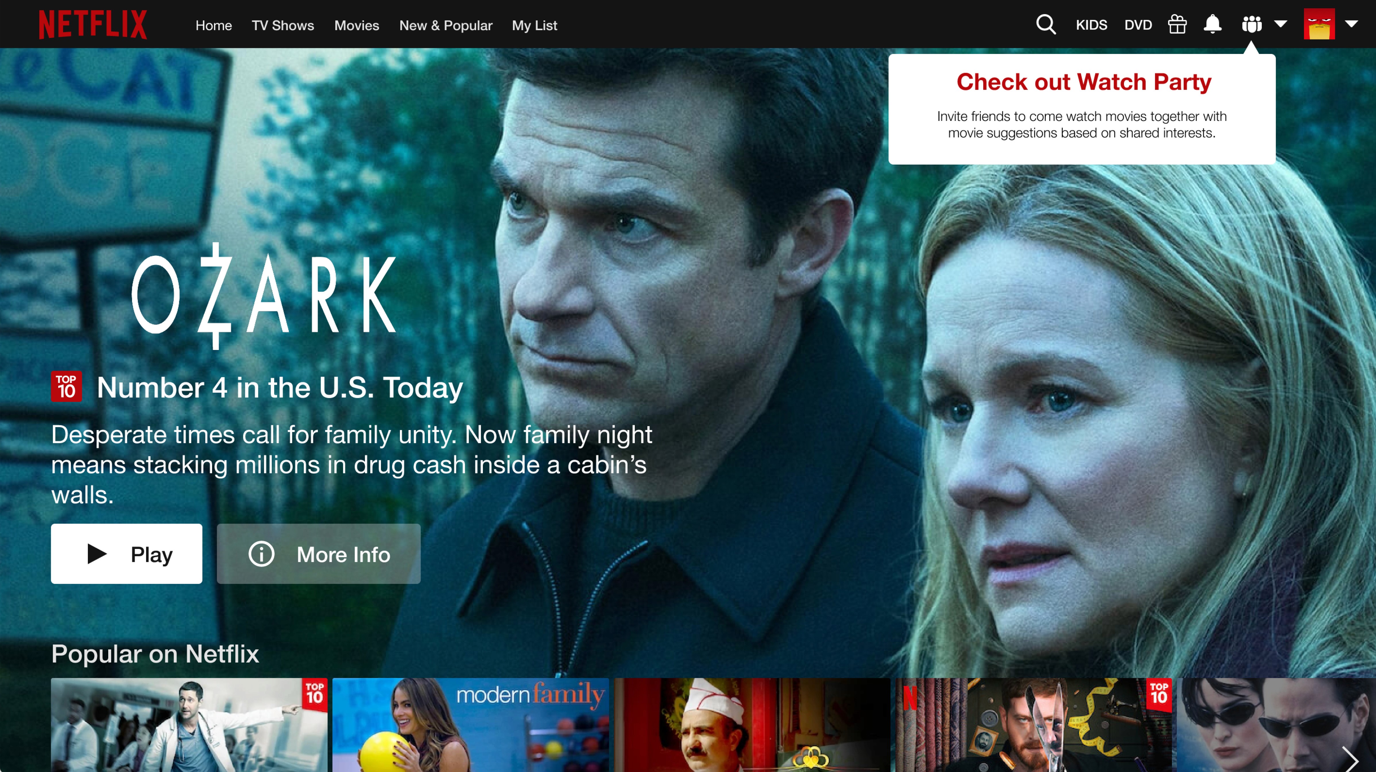
Netflix has been a household name for years, evolving from mailing DVDs to pioneering the world of streaming. As a leader in the industry, Netflix is always looking to innovate and enhance user experiences. So, what's next? Netflix Watch Parties! This feature aims to bring the communal movie-watching experience to subscribers, even when they’re miles apart.
The Challenge
In the time of a global pandemic, the need for shared social experiences has become more pronounced. Many people have moved away, severing connections with their social circles. The challenge was clear: How can we recreate the shared experience of watching movies together, even when physically apart? How can we make this experience seamless and keep the focus on the movie?
Team and Duration
This project was a two-week sprint from concept to high-fidelity prototype. Our team consisted of three designers: Bora Yuh, Charles Burns, and myself. We collaborated on research, ideation, and design, each bringing unique insights and skills to the table.
My Role
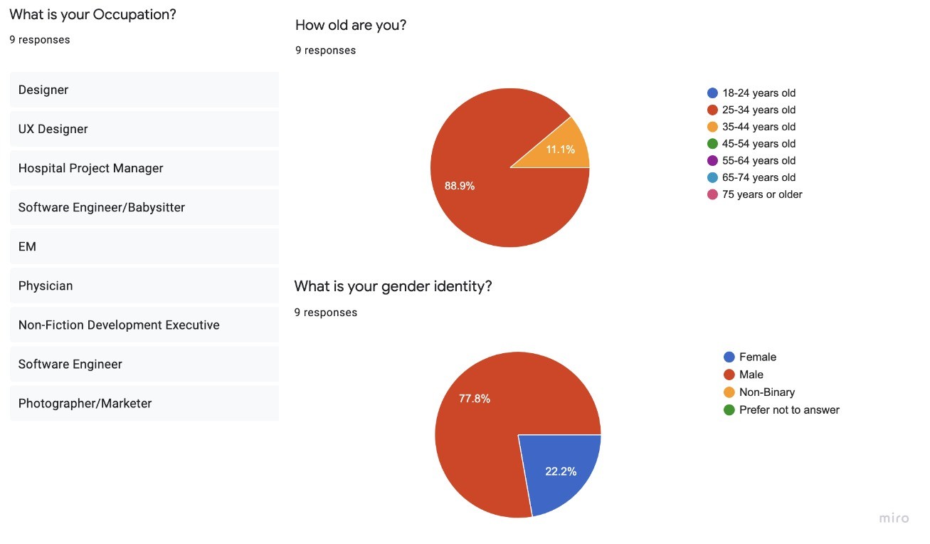
I led the research phase by creating a screener survey, polling 15 participants, and conducting two user interviews. I synthesized our research findings, crafted a journey map of current watch party options, sketched wireframes, developed a mid-fidelity prototype for testing, conducted user testing, and designed the high-fidelity prototype.
Prototype Video Below
—
Research
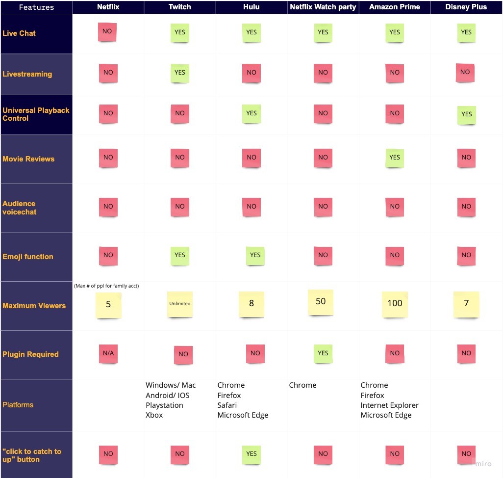
We started by mapping out the user experience of the current third-party Netflix watchparty options, focusing on the Teleparty extension. While it allowed simultaneous viewing and chatting, it was just one of many browser extensions, leading to confusion and inconsistency. We also checked out the watch party features of other streaming platforms like Disney+, Hulu, and Amazon Prime, identifying their strengths and shortcomings.
Teleparty User Flow
User interviews and surveys provided deep insights into what users value in shared movie-watching experiences. We even explored how other platforms, like online video games and Twitch, create shared experiences. The key takeaway was the desire for visual and auditory connection—seeing friends' reactions and hearing their laughter was crucial.
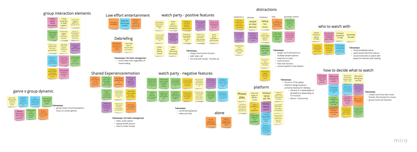
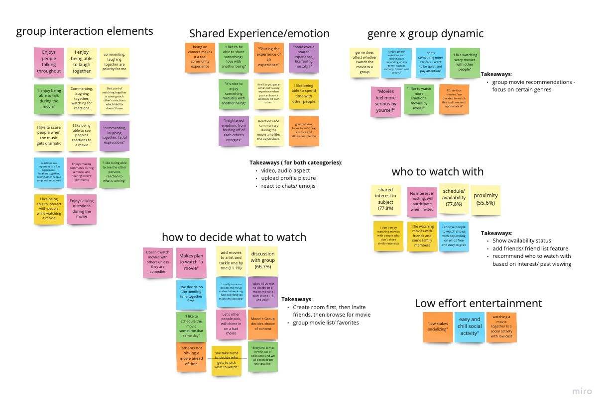
Affinity Mapping
We used affinity mapping to categorize and synthesize the insights gathered from our research. This process helped us identify key themes and user needs for the watch party feature.
User Persona: Zach Miller
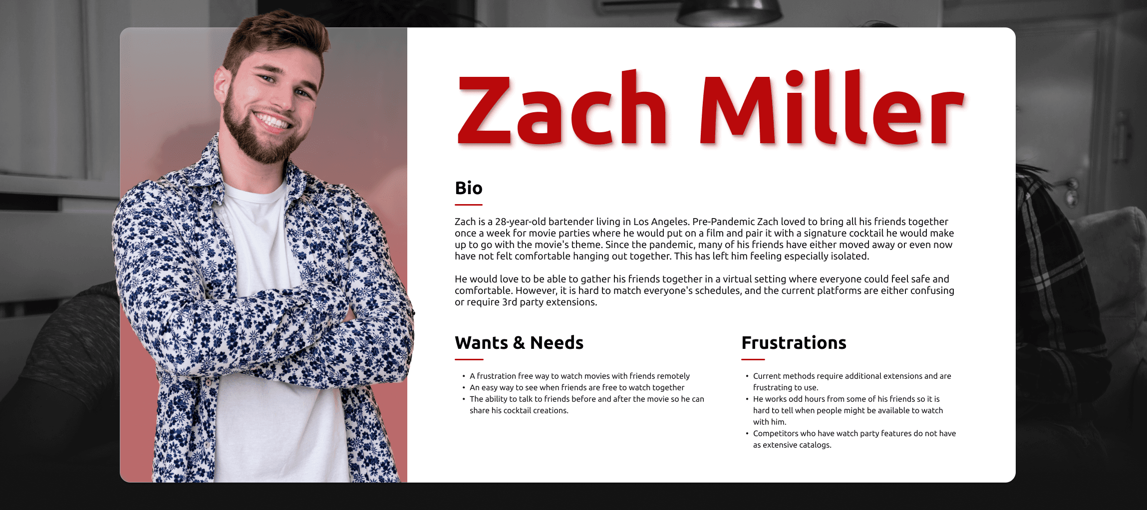
From our research, we created the persona Zach Miller, a social butterfly bartender who loved hosting themed movie parties pre-pandemic. Zach epitomized our target user: someone seeking a frustration-free way to watch movies with friends, see when others are available, and chat before, after, or between viewings.
Narrowing the Focus
Initially, we explored various ideas, including customizable avatars for voice interactions. However, we realized that focusing on what enhances the shared viewing experience was more effective. We chose a Zoom-like interface for this design because it was something that many people had become familiar with during the pandemic, making it a familiar framework for the feature interface.
Prototyping and Testing
We created a mid-fidelity prototype and tested it with four users. The testing validated our concept and highlighted areas for improvement, such as refining our feature icons. Armed with this feedback, I developed the high-fidelity prototype in Figma.
Challenges and Solutions
Time and skill level were the two biggest obstacles we faced. We only had two weeks to build this prototype, and as new UX students with a basic understanding of Figma, we had to dial down our big ideas to something feasible. This allowed my ability to learn programs quickly to shine; I went through many tutorials and videos to get the product as close to our vision as possible.
Visual Design
We based our prototype design on the color scheme and design systems used by Netflix to make it integrate as seamlessly as possible.
Final Prototype Features
The high-fidelity prototype included several key features:
Pre/Post-Viewing Room: Users could chat and hang out before and after the movie, suggest movies from curated lists matching group interests, and more.
Collapsible Interface: Users could adjust the level of interaction to their comfort while keeping the focus on the movie.
Online Friends Indicator: Users could see which friends were online before sending out invitations.
Thoughtful Guidance: Pop-ups and tooltips guided users through the experience seamlessly.
Competitive Analysis
We conducted a competitive analysis to compare Netflix watch parties' features with those of other streaming platforms. This analysis highlighted gaps and opportunities for Netflix to differentiate itself.
Team Dynamics
Since my team was fully remote, we used Discord to chat and video chat. We used Figma to simultaneously work on the prototype and tools like Miro to brainstorm together, as this was before Figma's jam feature.
Learnings
This project was a significant undertaking, and the lessons learned were invaluable:
Flexibility in Approach: We realized the importance of being willing to backtrack and reconsider our approach.
Foundation and Focus: Staying true to Netflix's foundation—enhancing the viewing experience—was crucial.
Vision for the Future: This project not only addressed the immediate need for watch party options but also opened doors to new possibilities, like advanced screenings and interactive viewings.
Conclusion
Our Netflix Watch Parties project aimed to recreate the communal movie-watching experience, bridging the gap created by physical distance. Through meticulous research, user-centered design, and iterative prototyping, we developed a feature that enhances social connections and enriches the Netflix experience.
